Kodak
Tags: General, Photography, Typography,
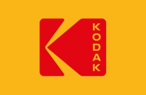
Kodak is the latest company to undergo a retro rebranding, reverting to its symbol of 34 years. The Kodak “K” is back, originally designed by Peter J. Oestreich in 1971 and used by the photography brand until 2006, though the new iteration by Work-Order uses stacked capitalised type for the word Kodak inside the letterform.
Capitalising the type is “the clearest departure from the past” says Work-Order, as Kodak has always used lower case. “The symmetry of the capital letterforms creates a molecular flexibility that allows the wordmark to be stacked,” says the design studio. “It is reminiscent of film perforations and street signage. It acts as a manufacturer’s stamp: the logo is the first read and the name is the supporting mark. When small, the name is removed leaving just the icon.”
The rebrand uses Kodak’s trademarked yellow and red, bringing a strong colour palette and unified branding across every aspect of the company’s packaging and visual identity.
Kodak joins Co-op and NatWest in a swathe of brands to recently return to a vintage graphic identity.